Helping Universal Orlando Resort Guests navigate the parks
A simple navigation feature designed to help Universal Orlando Resort Guests get from point A to point B without confusion.
Responsibilities
UX/UI Design
User Research
Software Used
Figma
Adobe Illustrator
Type of Project
Solo Project
Duration
4 weeks
PROBLEMGuests struggle to navigate the parks using the current Universal Orlando app
Whether I was visiting the parks with my mom or doing park support while working at Universal, I constantly overheard Guests saying they wished the app had a way to help them get around. It made me wonder, why hasn’t a navigation feature been added to help people get from point A to point B?
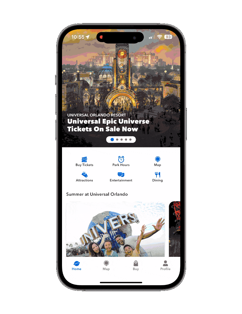
The Universal Orlando app doesn’t provide walking directions or real-time GPS
It only pins locations like restaurants, attractions, shops, etc, on a static map, leaving Guests to figure out how to get there themselves. This often leads Guests to stopping a Team Member for directions just to get from point A to point B.
So, how might we help Guests navigate the parks without having to stop and ask for help?

researchGetting to observe my mom use the app in the park for user research
Since my mom and I had the chance to go to the parks for the day, I thought this was a perfect opportunity to see how a regular Guest would navigate from one park to another during peak hours (11 am to 12 pm) while using the app's map. Here’s what I noticed as she was using the app.
⏱️
30 Minutes
Was the time it took to walk from Islands of Adventure to Universal Studios, with using the app’s map feature and just guessing based on signs and landmarks.
🤷♀️
+15 minutes lost
Despite checking wait times while walking to the destination, the ride ended up getting delayed. Without knowing how to get to the attraction, we missed the original wait time window.
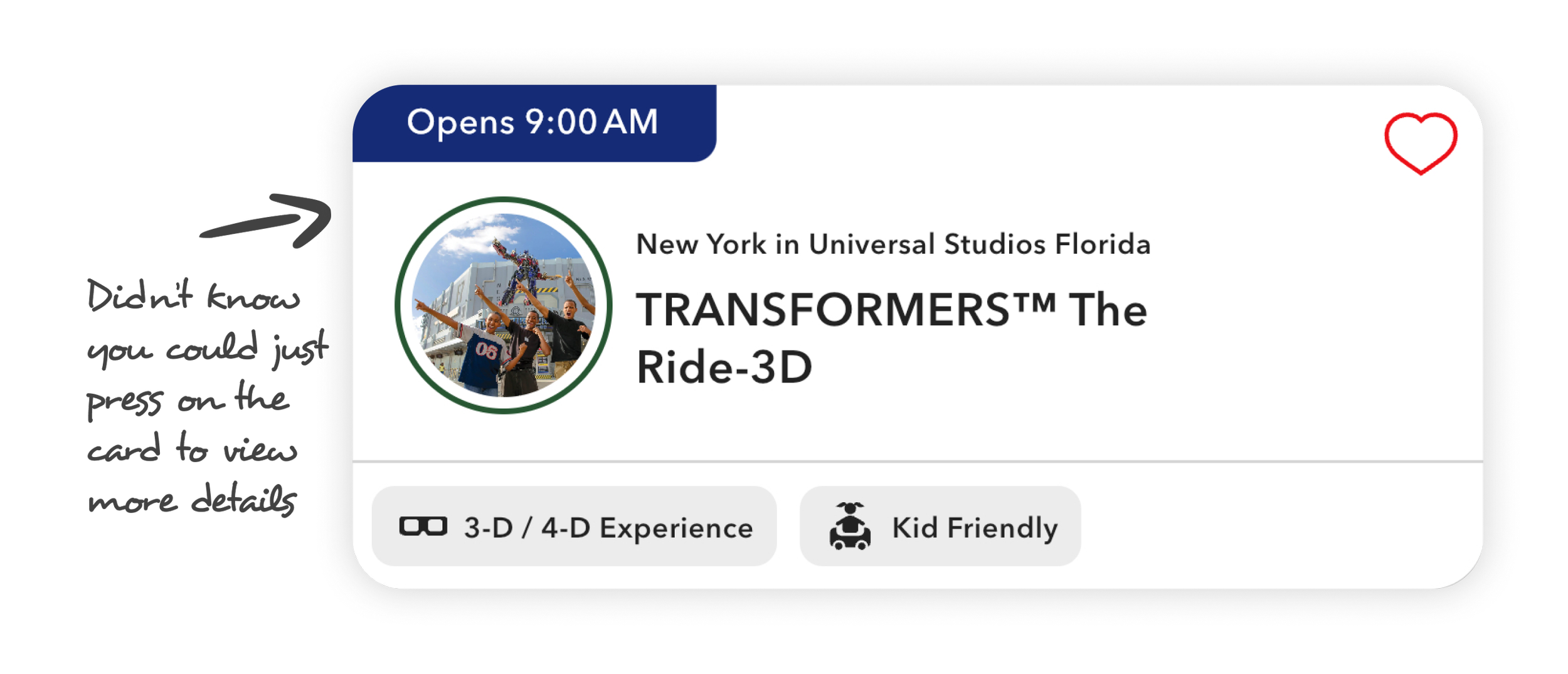
“I didn’t know I could tap that.”
My mom didn’t realize she could tap the app’s info cards (example on the left) for more details, plus she couldn't make out what was in the photo, which added to her confusion.
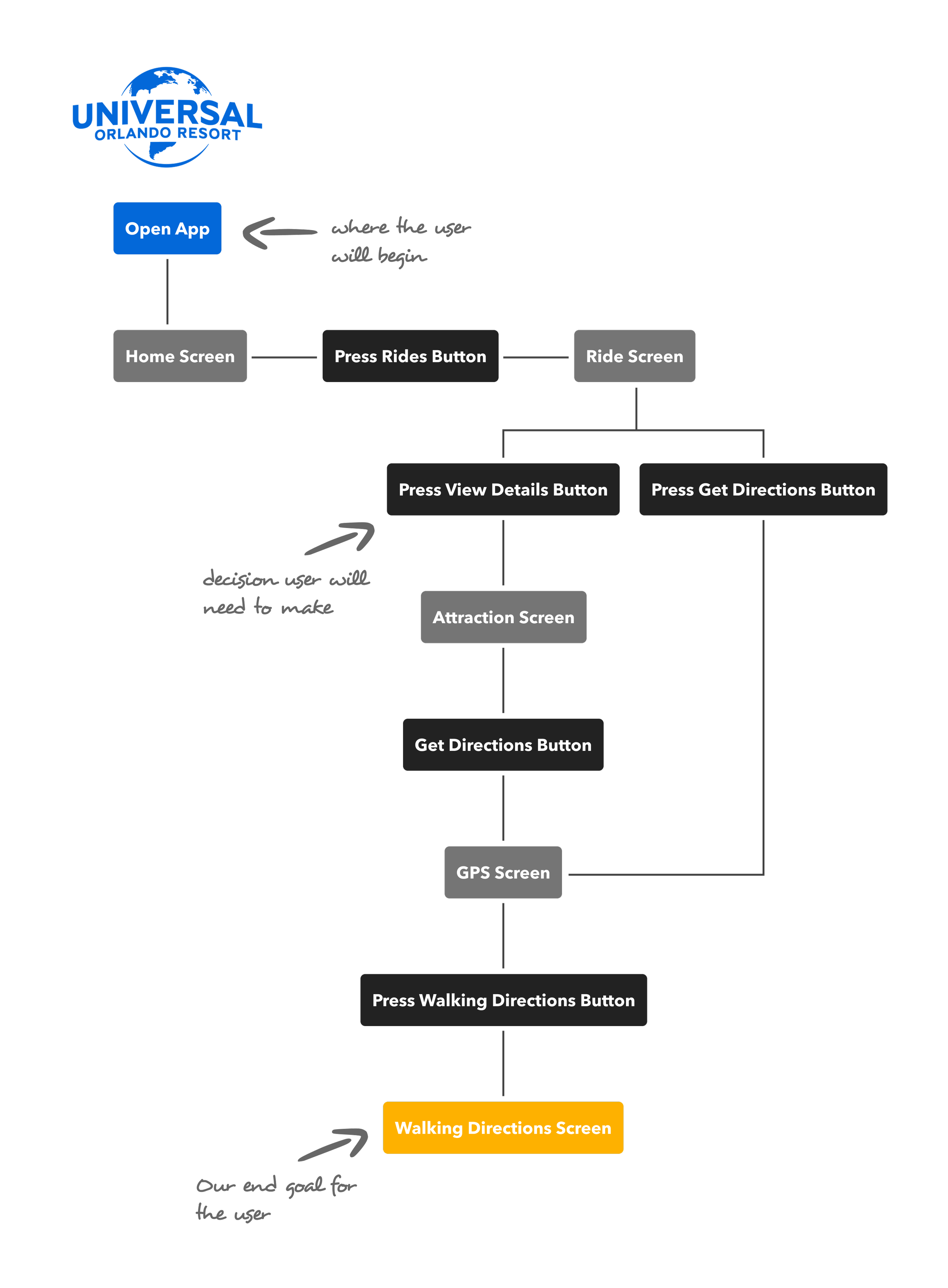
SolutionGuests struggle to navigate the parks using the current Universal Orlando app
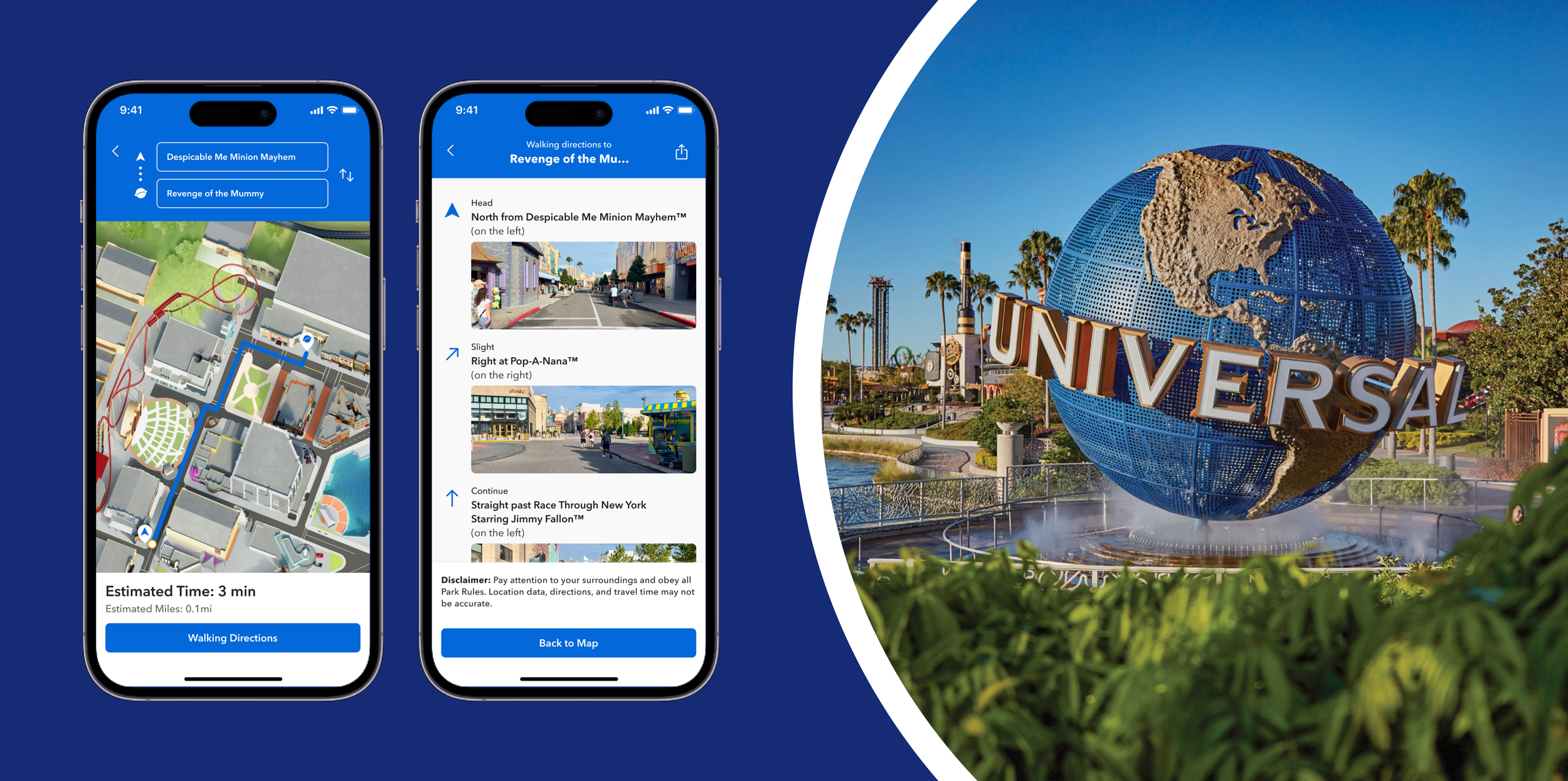
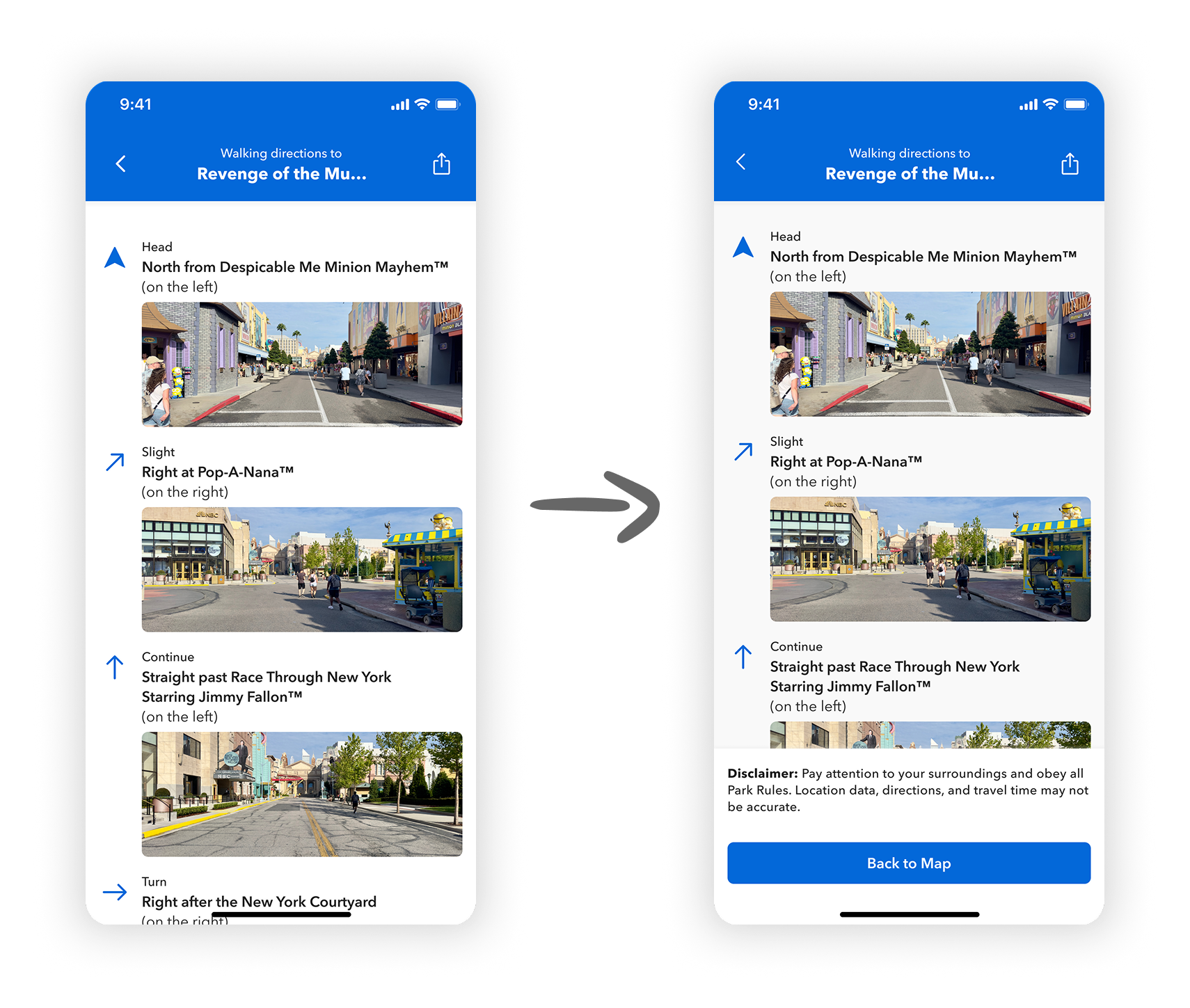
After seeing how confusing navigation was for Guests like my mom, I focused on adding a simple, GPS-powered directions feature to the Universal Orlando app. Instead of just showing pins on a map like the app currently does, this new feature would guide Guests from their current location to a chosen destination with turn-by-turn instructions and street-view photos to support Guests who need visual confirmation, not just text.

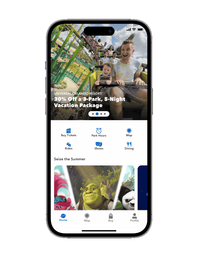
To make this feature easier to access, I also redesigned the attraction cards to include two clear buttons: one for viewing ride details, and one for getting directions right away.
For example, if a user taps on Revenge of the Mummy, they can choose to either view ride info or get walking directions from their current location.

Original Card Design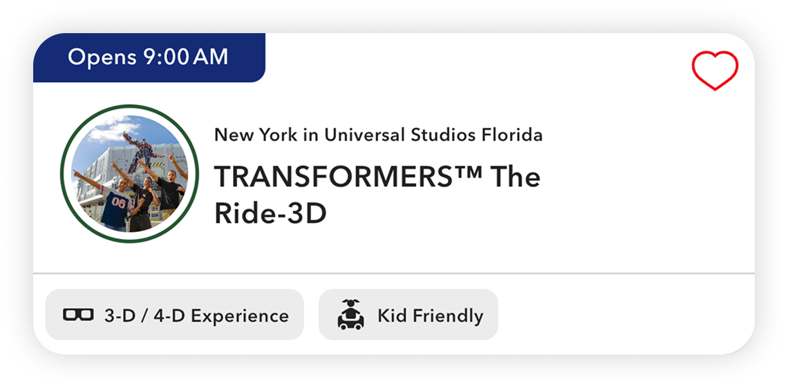
New Card Design
How would this new feature flow actually help
Let’s say we’re a Guest at Universal who just got off a ride and we’re ready to hit the next one, but we’re not totally sure what to ride yet.
With this new flow, we have options:
We can browse the attractions list and either tap “View Details” to learn more, or tap “Get Directions” right away if we’ve already made up our mind.
Even if we view the attraction details first, we can still get directions directly from that screen; no extra searching, no backtracking.
It’s fast, flexible, and helps Guests make confident decisions on the go.
User testing & IterationsImproving two small details
I ran a quick round of user testing with 3 people familiar with the Universal app. Overall, the flow felt intuitive and easy to follow from what was gathered, except for two things…
Adding a “Back to Map” button
Based on user feedback, adding a “Back to Map” button at the bottom of the screen made it easier to return to the main attractions list, instead of relying on the back buttons at the top to navigate through multiple screens.
Keeping the disclaimer visible
Adding from the user feedback, some didn’t notice the disclaimer until they reached the bottom of the screen. By keeping it fixed above the “Back to Map” button, it stays visible, reminding users to read important information before heading to their destination.

My main takeaways and what I’d like to implement for future iterations
This project gave me the chance to rethink how guests navigate high-traffic spaces like theme parks, especially when they need quick, confident decisions on the go. I looked at apps like Google Maps and Disney’s mobile app for navigation patterns, then redesigned the experience with Universal’s guests and brand in mind.
For future iterations, I’d love to explore how the feature could adapt during seasonal events like Halloween Horror Nights or Mardi Gras, where the park layout and guest flow change dramatically. I’d also be curious to explore motion design opportunities, like timed visual cues when certain in-park events happen (for example, when the dragon at Diagon Alley breathes fire).
View My Other Projects
Scenario-based course that helps new managers handle team conflict with confidence
e-Learning Development · Visual Design
Disclaimer: This is a personal project

Rise course that helps new hires confidently recognize red flags and report phishing attempts before it's too late
Microlearning · Learning Design · Visual Design
Disclaimer: This is a personal project